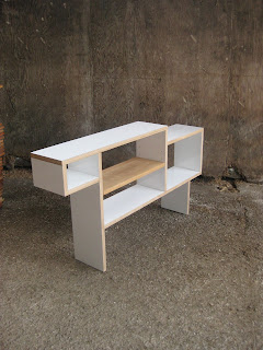
A highly deserving winner of the Turner Prize this year, in Martin Boyce.
'the things that we pass through every day and occasionally catch a glimpse of, and maybe see something that has a meaningful resonance .......I guess the work is to amplify those moments....
It's a collapse of architecture and nature'.
Tuesday, 6 December 2011
Thursday, 24 November 2011
Wednesday, 23 November 2011
Tuesday, 22 November 2011
Tuesday, 8 November 2011
Tuesday, 18 October 2011
todosomething
Very interesting new piece from todosomething via Specific Merchandise. Just think that the balance of materials is very nicely judged, with the concrete being treated as the cushion, and also the flash of colour with the painted board ends.
Friday, 14 October 2011
Pylon Design Winner
I guess this is what happens when you have an MP, the Energy secretary, Chris Hunhe on the judging panel of what should be a creative competition. The winning design for the recent brief is just plain dull, and its certainly not going to look any better in twenty years time. I am not saying my initial sketch is better in any way, (i did not even enter), but I think the idea of creating a hybrid pylon is much more future thinking. The middle of the pylon is a wind turbine, feeding directly back into the thing it is supporting, the grid. In built up or conservation areas, just leave out the turbine.
At least there is one saving grace with this competition, there was no obligation to use or develop the winning design, and they are looking at others.
At least there is one saving grace with this competition, there was no obligation to use or develop the winning design, and they are looking at others.
Thursday, 13 October 2011
Edward Taylor
Edward Taylor's Helios light ... "a task lamp composed entirely of high strength magnets, totally customisable, capable of being assembled or dismantled with ease. Aluminum, Steel, Walnut, Rubber."
Monday, 10 October 2011
La Bolleur
For those of you who have taken my previous advice to keep tabs on La bolleur, and are in the know already, apologies. I love them, and can put their success down to the most basic, overiding desire to only make, organise and get involved with projects that they Really want too. The obvious enjoyment of the work imbues the finished projects with wonderful mellow energy.
Friday, 7 October 2011
Wednesday, 5 October 2011
Bert Jansch 1943 - 2011
Very, very sad news Yesterday, with the death of Bert Jansch. I think (hope) 6 Music will be paying homage to the great man today, so should be worth tuning in.
Tuesday, 4 October 2011
Friday, 30 September 2011
Thursday, 29 September 2011
In search of lost time
Apparently this was doing the rounds a couple of years ago, I missed it and do not particularly like the interior. But...It is just very interesting to imagine how the clock faces affect the feel of the space. On one hand it must be like living a theatre set for some superhero story, but it also must be strangely quiet and eerie to look at the same time over and over. Can your hear the ghost of the inner workings, the once incessant noise. And also what about the emotion from outside? nobody is looking at the building anymore, its kind of lost its purpose, it is sad. Very emotionally complicated.
Wednesday, 28 September 2011
Studio Pepe Heykoop
A lot of stuff on Studio Pepe Heykoop site, and hugely varied too. The leather lampshades shown are the most accessible of the work, drawing on metal industrial shades as inspiration, but hand sewn in leather with help from the Tiny Miracles Foundation. More experimental and selfish work includes a soft oak chair, some (Martino) Gramperesque arrangements and the XXL lampshade.
Tuesday, 27 September 2011
The coolest place on Earth?
Silencio is about to open it's doors in Paris. It is devised and designed by David Lynch, inspired by one of his films 'Mullholland Drive', and will feature live stages, an art library, lounges, bars and a cinema. Apparently, this place is amazing, The curved walls are lined with wooden blocks covered in gold leaf and Lynch has even designed a new, ergonomic cinema seat to refine the experience. Over the top? of course, but totally valid and intriguing none the less.
Les Pas Perdus
This is the sort of project that I find truly humbling to see. Les Pas Perdus have turned an old mining village into a morphing surreal installation of goodness, culminating in an 8 metre high sweeping staircase constructed from used pallets. Oh Yes.
Monday, 26 September 2011
Jasper Morrison
I will be rounding up some bits from The London Design Festival over the next week or so. Starting with the brilliantly simple show at The Jasper Morrison Shop, 300 Years of Drinking Glasses. Promoting historical, contextual debate through seemingly the most basic of objects.
Marquetry Postcard
Hey Tim, thank you very much for the wooden postcard. Absolutely amazing. Thought you might find this musical bin of some interest too (Tim & I have dabbled in making musical furniture before).
Hope all is going super well and good in Japan. X
Hope all is going super well and good in Japan. X
Friday, 23 September 2011
Wednesday, 24 August 2011
Subarquitectura
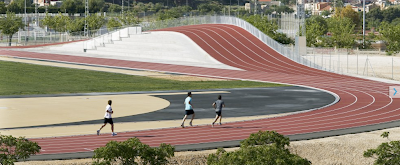
Suarquitectura's running track in Elda Spain brilliantly adds another mound like section of track as both a roof to cover the changing rooms and also to provide seating for viewers. I really like this, there is initially an element of fun, (with almost childhood scaletrix ideas,) but the more I look the more I appreciate it's subtlety. It's important to note how good this looks from the outside too. Provincial athletic tracks are normally dead flat and very boring , with everyone standing at the same level. But this has a very individual personality, and I would imagine a certain magnetism because of that.
Tuesday, 23 August 2011
Monday, 22 August 2011
Busy Busy
As you all know, crazy busy at the moment so it's a drip feed blog. I have NOT given it up, so keep checking, and expect much more in a few weeks. In the mean time: a cute concrete lamp and giant watch print T-shirts.
Both sound very wrong, but look very good.
Both sound very wrong, but look very good.
Friday, 12 August 2011
Heribert C. Ottersbach
Ottersbach really does it for me, combining many of my interests - urban landscape, monochrome, division of a rectangle, modernity and process - all at Ben Brown Fine Arts.
"If painting still wants to be taken seriously within the overall social discourse, and not be dismissed as office, insurance, or bank building-compatible service, it must establish its canon anew. Less is no longer more."
"If painting still wants to be taken seriously within the overall social discourse, and not be dismissed as office, insurance, or bank building-compatible service, it must establish its canon anew. Less is no longer more."
Thursday, 11 August 2011
Wednesday, 27 July 2011
Design for Download
Little Interview here with the Rietveld obsessed (not a bad thing) Minale-Maeda, talking about their new project with Droog. Really not sure what to make of this yet, having free plans for people to copy is absolutely nothing new. Low Tech: fast furniture for next to nothing is 30 years old, and woodworking magazines have included plans for ever, so, the only real difference is the 'printable brackets' used to construct the pieces. Are these purely conceptual? or are they real ? If so, how is something made out of paper going to give any sort of structure to a cupboard?
Might have to mull this one over, and waffle on a bit more about it later.
Might have to mull this one over, and waffle on a bit more about it later.
Tuesday, 26 July 2011
New Craftsman Gallery
Detail shot of the window display for a recent refurb of the New Craftsman Gallery. More photos on the website soon.
Sunday, 24 July 2011
Friday, 22 July 2011
Wednesday, 20 July 2011
Klauser & Carpenter
New(ish) epic marble table from Klauser & Carpenter. There is a lot going on here, a mix a craft and technology, a nod to Saarinen and a wink at British abstraction.
(Hope you are both well and good).
(Hope you are both well and good).
Kenneth Grange
Kenneth Grange - Making Britain Modern, opens at the Design Museum today. In some way Grange has a real problem as he has designed many iconic products and objects that are disliked, hated even. Parking meters do not conjure the nicest thoughts, an Intercity 125 invokes stressful commutes, London Taxi's are never around when you need one (and extortionate when they are), and I got bored with shaving and opted for the hairy look years ago.
But, and its a big BUT, everyone of these objects are part of our memory, our subconscious, they are supposed to look like they do. The new London Taxi is what a London Taxi looks like, the old ones look wrong now. The Japanese Bullet Train is like a pumped up version of the 125 and looks stunning, and I for one would rather have the old parking meters back, they are more human than parking attendents, they make noise, they have moving parts, they are what a parking meter should still be.
In some way Grange is riduculously simple, he is a very clear thinker with no frills or embellishment, but the designs are highly intelligent. 'Making Brtitain Modern' is an apt title for the exhibition, but the most amazing thing about Grange is how he has affected the way we view the see and perceive, he is inside our brains, his work is part of the landscape.
Tuesday, 19 July 2011
Tom Jarvis
Product design today is very much about updated versions of existing objects, rather than something completely new. Dyson's Air Multiplier uses a revolutionary design, but it still only blows air at you, it is still a fan. And when the 'ground-breaking' I-phone 5 is launched soon, it will probably be pretty much the same as the last version, even though everyone will still want one. Tom Jarvis bucks this, with his unique and niche 'Tools to Service an Orchestra' which are designed specifically to allow brass section musicians to dismantle various parts of their instruments, for cleaning and maintenance. Not only are some musicians going to have an hallelujah moment, but these beautiful objects are going to intrigue everyone else, adding something truly new and fascinating to the (product) world.
Monday, 18 July 2011
Thursday, 14 July 2011
Wednesday, 13 July 2011
Sorry, I have lost all the info on where i found this, and I am not exactly sure why I like it. I think it's the formal composition of the photo, kind of reminds me of a family portrait, where everyone is all smartly lined up. Except that when you get the photo developed, you realise your drunken, maverick uncle has managed to squeeze in between Granny and Grandad without anyone noticing.
Monday, 11 July 2011
Glass Hill
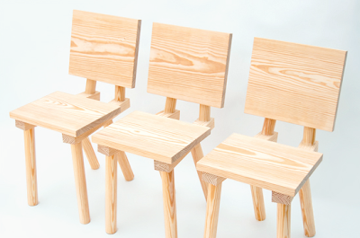
Only a year and a half after its conception, Glass Hill's folio reaches far and wide but what really interests me is the connection with materials and construction. In a computer designed, flat pack furniture age, the link between thee initial concept and the finished piece (between the Brain, Hand and Tools if you like) is broken. But, the only literature on the website connected to Glass Hill's Philips de Pury chair reads,
"Chair,
Edition of 25
"Chair,
Edition of 25
Southern Yellow Pine variously planed, dimensioned and machined.
450mm front seat height pitched at 3degrees to rear along 290mm deep seat. Back rest opens at 102.5 degrees from seat plane rising to 760mm above floor height and dropping 290mm towards seat back. Overall depth of seat area from back rest plane is 360mm. Seat is mounted to double rails set at an angle 6 degrees from seat edge with 8 no. 4x40mm screws. Both rails are EX45x60mm with a machined top angle of 4 degrees in opposing lateral planes. All legs and support for back rest are morticed into this rail. Front leg mounts perpendicular to rail and seat, back leg at 24 degrees from seat angle and back rest mount at 12.5 degrees on opposing (top) surface. The sides of the chair are parallel."
Concrete Stitches
The Concrete Stitches series from James Plumb. The voids left by broken and missing pieces of furniture are filled and replaced with concrete blocks. It's a strange and somewhat complicated aesthetic, but (as with all their stuff), works very well.
Subscribe to:
Comments (Atom)


