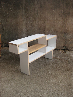
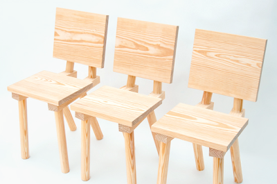
Little Interview here with the Rietveld obsessed (not a bad thing) Minale-Maeda, talking about their new project with Droog. Really not sure what to make of this yet, having free plans for people to copy is absolutely nothing new. Low Tech: fast furniture for next to nothing is 30 years old, and woodworking magazines have included plans for ever, so, the only real difference is the 'printable brackets' used to construct the pieces. Are these purely conceptual? or are they real ? If so, how is something made out of paper going to give any sort of structure to a cupboard?
Might have to mull this one over, and waffle on a bit more about it later.
Wednesday, 27 July 2011
Tuesday, 26 July 2011
New Craftsman Gallery
Detail shot of the window display for a recent refurb of the New Craftsman Gallery. More photos on the website soon.
Sunday, 24 July 2011
Friday, 22 July 2011
Wednesday, 20 July 2011
Klauser & Carpenter
New(ish) epic marble table from Klauser & Carpenter. There is a lot going on here, a mix a craft and technology, a nod to Saarinen and a wink at British abstraction.
(Hope you are both well and good).
(Hope you are both well and good).
Kenneth Grange
Kenneth Grange - Making Britain Modern, opens at the Design Museum today. In some way Grange has a real problem as he has designed many iconic products and objects that are disliked, hated even. Parking meters do not conjure the nicest thoughts, an Intercity 125 invokes stressful commutes, London Taxi's are never around when you need one (and extortionate when they are), and I got bored with shaving and opted for the hairy look years ago.
But, and its a big BUT, everyone of these objects are part of our memory, our subconscious, they are supposed to look like they do. The new London Taxi is what a London Taxi looks like, the old ones look wrong now. The Japanese Bullet Train is like a pumped up version of the 125 and looks stunning, and I for one would rather have the old parking meters back, they are more human than parking attendents, they make noise, they have moving parts, they are what a parking meter should still be.
In some way Grange is riduculously simple, he is a very clear thinker with no frills or embellishment, but the designs are highly intelligent. 'Making Brtitain Modern' is an apt title for the exhibition, but the most amazing thing about Grange is how he has affected the way we view the see and perceive, he is inside our brains, his work is part of the landscape.
Tuesday, 19 July 2011
Tom Jarvis
Product design today is very much about updated versions of existing objects, rather than something completely new. Dyson's Air Multiplier uses a revolutionary design, but it still only blows air at you, it is still a fan. And when the 'ground-breaking' I-phone 5 is launched soon, it will probably be pretty much the same as the last version, even though everyone will still want one. Tom Jarvis bucks this, with his unique and niche 'Tools to Service an Orchestra' which are designed specifically to allow brass section musicians to dismantle various parts of their instruments, for cleaning and maintenance. Not only are some musicians going to have an hallelujah moment, but these beautiful objects are going to intrigue everyone else, adding something truly new and fascinating to the (product) world.
Monday, 18 July 2011
Thursday, 14 July 2011
Wednesday, 13 July 2011
Sorry, I have lost all the info on where i found this, and I am not exactly sure why I like it. I think it's the formal composition of the photo, kind of reminds me of a family portrait, where everyone is all smartly lined up. Except that when you get the photo developed, you realise your drunken, maverick uncle has managed to squeeze in between Granny and Grandad without anyone noticing.
Monday, 11 July 2011
Glass Hill
Only a year and a half after its conception, Glass Hill's folio reaches far and wide but what really interests me is the connection with materials and construction. In a computer designed, flat pack furniture age, the link between thee initial concept and the finished piece (between the Brain, Hand and Tools if you like) is broken. But, the only literature on the website connected to Glass Hill's Philips de Pury chair reads,
"Chair,
Edition of 25
"Chair,
Edition of 25
Southern Yellow Pine variously planed, dimensioned and machined.
450mm front seat height pitched at 3degrees to rear along 290mm deep seat. Back rest opens at 102.5 degrees from seat plane rising to 760mm above floor height and dropping 290mm towards seat back. Overall depth of seat area from back rest plane is 360mm. Seat is mounted to double rails set at an angle 6 degrees from seat edge with 8 no. 4x40mm screws. Both rails are EX45x60mm with a machined top angle of 4 degrees in opposing lateral planes. All legs and support for back rest are morticed into this rail. Front leg mounts perpendicular to rail and seat, back leg at 24 degrees from seat angle and back rest mount at 12.5 degrees on opposing (top) surface. The sides of the chair are parallel."
Concrete Stitches
The Concrete Stitches series from James Plumb. The voids left by broken and missing pieces of furniture are filled and replaced with concrete blocks. It's a strange and somewhat complicated aesthetic, but (as with all their stuff), works very well.
Thursday, 7 July 2011
Rubbish Goes Here
Interesting photo's from Rubbish Goes Here . A few steps on from the World of Interiors style 'faded grandeur' photo shoots, RGH concentrates on what is left behind, the remnants, the discarded.
"If there is a constant theme in my work, it is the effort to document places in transition. I’ve always been interested in Chicago’s architectural and industrial history. Unfortunately much of that history is being erased with bulldozers in the name of Urban Renewal or Gentrifications. Photography has been a way for me to document that change. For years, that meant shooting abandoned and soon to be demolished buildings around Chicagoland—schools, factories, and hospitals. It amazed me that these places, often of architectural or historical significance, were left to rot."
Wednesday, 6 July 2011
Mark Matcham
Good sunny morning fun with more oversized stuff, this time from fresh Brighton graduate Mark Matcham, and his 6m deck chair.
Cy Twombly
Very sad news today, the death of Cy Twombly aged 83 in (his adopted home) Rome. Twombly was an artsists artist, his ability to convey such emotion, using seemingly so little, was simply astonishing. Long may his work be celebrated.
Tuesday, 5 July 2011
Jimmy Fiction
Jimmy Fiction is now up and running, making 'monumental typography' to order. Don't know exactly why this grabs me so much, it's not like I would want to actually spell a word, but there is something seriously appealing about having some of his giant letters to dot around,stand on end, hang on the wall, move inside, sit on, etc, etc.
Subscribe to:
Comments (Atom)


